
Watch a Cumulative Flow Diagram Build Itself, Day by Day
Important to remember
Many people don’t understand a Cumulative Flow Diagram the first time they see one.
I’ve taught Scrum and Kanban to thousands of people. When I show a finished CFD, some students see the story in it immediately. Others see colored bands and wonder what they’re supposed to notice.
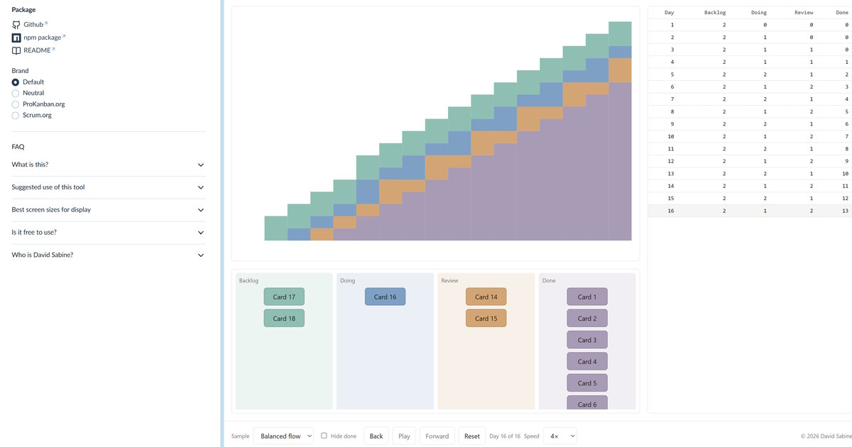
So I built a tool that shows it happening. You can try it here: CFD Tutorial demo.
A blank Kanban board and a blank CFD are on the screen. Press Play, and cards move across the board one day at a time while the chart grows to match. When a card moves from Doing to Review, the Review band gets thicker. When work piles up in progress, students watch the band widen.
Cumulative Flow Diagram demystified.
What’s in the tool
The tool comes with four sample stories, and each one teaches a different pattern:
- Balanced flow. Work arrives and finishes at a steady pace, and the bands stay parallel.
- Growing WIP. More work starts than finishes, and the work in progress grows.
- Recovery. A system quickly has too much work in progress, but the team gets it under control.
- Arrival spike. On day 7, a sudden flood of new work shows up.
A data table beside the chart shows the daily counts, so students can connect each number to the shape it makes. There is also a “Hide done” option to demonstrate to students what a flow diagram might look like without the cumulative effect.
Make it yours
I made it for my own classes, but you’re welcome to use it. It’s free and you can even rebrand it to make it match your own course materials.
First, you can use this online demo version. You can open the demo already arranged for a class. Add ?sidebar=hidden to start with the sidebar closed. Add ?brand=neutral (or default, prokanban, or scrum) to preselect a brand. Add ?colormode=dark or light to preselect the color mode. One ready-made link is ProKanban.org in dark mode, sidebar closed (https://davesabine.com/cfd-tutorial/demo?sidebar=hidden&brand=prokanban&colormode=dark).
Or use the JavaScript file in your own web page. Point a script tag at this address and it will load the newest 1.x release:
<script src="https://cdn.jsdelivr.net/npm/@davidsabine/cfd-tutorial@1/dist/cfd-tutorial.js"></script>
Or install it with npm (npm install @davidsabine/cfd-tutorial) or copy cfd-tutorial.js onto your own site.
Then add an empty div, a short settings script, and the bundle. (Ask your LLM for help if you’re not already comfortable with those instructions.)
The settings let you add your own brand in the header, your own copyright line in the footer, a custom title, and the sample story that loads first.
The styling is just as flexible. Colors, fonts, spacing, and corner radius are all CSS variables, so you can match your own brand palette in a few lines of CSS. That includes the four chart colours, which are shared with the board lanes and cards. If your site uses Tailwind, the variables line up with the usual theme tokens.
Full instructions are in the package README on GitHub.
Why does this matter?
A CFD is one of the most useful charts a team can learn to read. It shows WIP, throughput, and delays in one picture. But if students can’t read it, they’ll never use it.
Ten seconds of watching the chart grow can save ten minutes of explaining it.
If you teach Kanban, Scrum, or flow, try it in your next class.